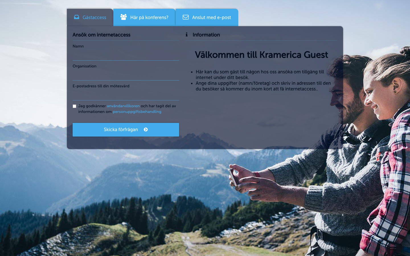
Look & Feel
Brand the Captive Portal: logo, fonts, panel colors, button styling, and the simplified-layout toggle.
Every Sign-In Context has one Captive Portal. Look & Feel is where you shape how that portal looks to guests — logo, fonts, colors, and the two shape switches (Form Type, Button Type) that set the overall mood of the page.
Open Portal Configuration → Look & Feel from the Context admin.
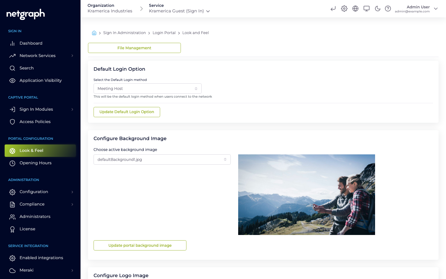
Auto-fill from your brand site
Section titled “Auto-fill from your brand site”The first card on Look & Feel analyses your Organization’s homepage and proposes a starting look — colors, panel and button shape, logo, background, fonts, and the Display Organization Logo toggle — which you can then refine with the manual controls further down the page. The URL field is pre-populated with the Organization’s registered website when one is set; replace it with any other public URL to pull styling from that page instead.
-
Enter a URL
Type the homepage URL you want to analyse into the URL field (for example
https://www.your-brand.com). Analyze becomes active once the value is a validhttp://orhttps://address. -
Run the analysis
Click Analyze. The card displays a progress list covering the four stages — reading the landing page, extracting colors and fonts, selecting the best candidates, and preparing the images — and typically completes within 30–60 seconds. Click Cancel at any point to stop the run; no changes are made.
-
Review the proposal
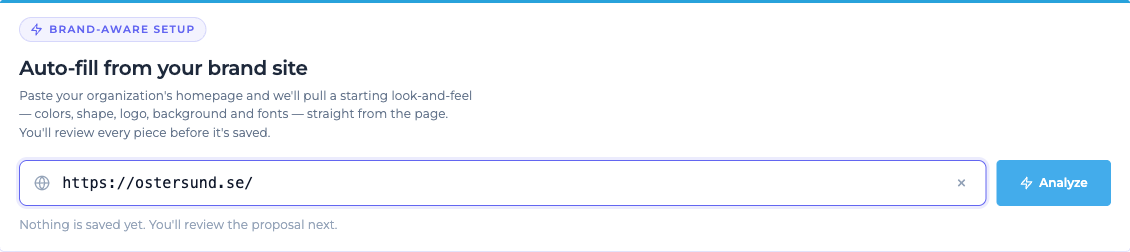
Once the analysis completes, the card switches to a Proposal ready view with six sections — Color palette, Panel & button shape, Logo, Background, Fonts, and Options (the Display Organization Logo toggle). A live preview of the Captive Portal using the proposed values appears on the right.
-
Select sections to apply
Each section has a checkbox; clear the checkbox for any section you do not want to apply. For Logo and Background, a thumbnail row beneath the primary pick lets you swap it for one of the alternatives the analyser identified.
-
Apply or discard
Click Apply N sections to save the selected sections to this Sign-In Context. Discard removes the proposal without changing any existing settings. After applying, the card shows an Applied from URL confirmation with a Run again button.
Note
Nothing is saved to the Context until you click Apply. Fonts are mapped to the five bundled font presets. Every applied value remains editable from the manual cards below.
If the analyser can’t reach the page or can’t extract a usable starting look, the card shows one of the messages below. Use Run again to retry if the cause may be transient, or configure Look & Feel manually using the cards below.
- Timed out reaching the website
- TLS/certificate problem reaching the website
- This site is blocking automated access (HTTP 429/403). Try again later or upload assets manually.
- Couldn’t pull a starting look from this page. Try another URL — or configure the look and feel manually below.
File Management
Section titled “File Management”The logo, fonts and background image are picked from a library of files you’ve uploaded previously. Use File Management (button at the top of Look & Feel) to upload:
- Logos — PNG, SVG, or JPG. Transparent backgrounds usually look best.
- Fonts —
.woff,.woff2, or.ttf. - Background images — JPG or PNG, full-page. The portal blurs the edges slightly; center-safe compositions work best.
After upload, the file name appears in the corresponding section’s dropdown.
Default Login Option
Section titled “Default Login Option”- Select the Default Login method — the sign-in method that opens first when guests hit the portal. Changing this doesn’t hide other methods; it only controls which tab is active by default.
Save with Update Default Login Option.
Configure Background Image
Section titled “Configure Background Image”- Choose active background image — pick one of the uploaded images. The preview thumbnail shows what will render behind the sign-in card.
Save with Update portal background image.
Configure Logo Image
Section titled “Configure Logo Image”- Display Organization Logo — toggle whether a logo is shown above the sign-in form.
- Choose active Logo image — select the uploaded logo.
Save with Update Logo background image.
Configure Font
Section titled “Configure Font”- Header Font — used for headings and the welcome text.
- Main Font — used for body text and form fields.
Save with Update Font Settings.
Configure Login Portal colors & buttons
Section titled “Configure Login Portal colors & buttons”Two groups sit inside this section: Panel configuration (the sign-in card itself) and Login button configuration. Both save together with the single Update Colors and Buttons button at the bottom.
Panel configuration
Section titled “Panel configuration”| Setting | Applies to | Default |
|---|---|---|
| Choose Form Type | Sign-in card shape — Square or Rounded. | — |
| Text Color | Body text on the sign-in form. | #000d1e |
| Input Text Color | Text the guest types into form fields. | #555555 |
| Tabs Text Color | Labels on the login-method tabs. | #ffffff |
| Front Color | Tabs and links color. | #000d1e |
| Terms Color | Privacy Policy / Terms and Conditions link color. | #000d1e |
| Background Color | Tabs and panels background color. | #ffffff |
| Background Opacity (%) | 0 to 100 — how much the background image bleeds through the card. | 64 |
| Shadow Offset | Button and input form shadow offset. | 0 |
| Shadow Blur | Button and input form shadow blur. | 4 |
Each color field has a swatch picker on the left and a Hex Value text field on the right. Either side accepts input.
Login button configuration
Section titled “Login button configuration”| Setting | Applies to | Default |
|---|---|---|
| Choose Button Type | Button shape — Square or Rounded. | — |
| Button Color | Sign-in button background. | — |
| Button Text Color | Sign-in button text. | — |
Configure Portal Appearance
Section titled “Configure Portal Appearance”- Display simplified (no tabs) login portal if only one login option is selected — when a Context has just one active login method, this toggle hides the tab row and renders the single form full-width.
Save with Update Portal Appearance.
Per-language assets
Section titled “Per-language assets”Look & Feel settings apply across all languages. To change the text per language (welcome text, module labels, terms copy), see Languages.
Preview the portal
Section titled “Preview the portal”Click the Captive Portal icon at the top of the admin header (hover to see the tooltip) to open the live portal in a new tab. Save Look & Feel changes first — the portal reads from the backend each time it loads.